
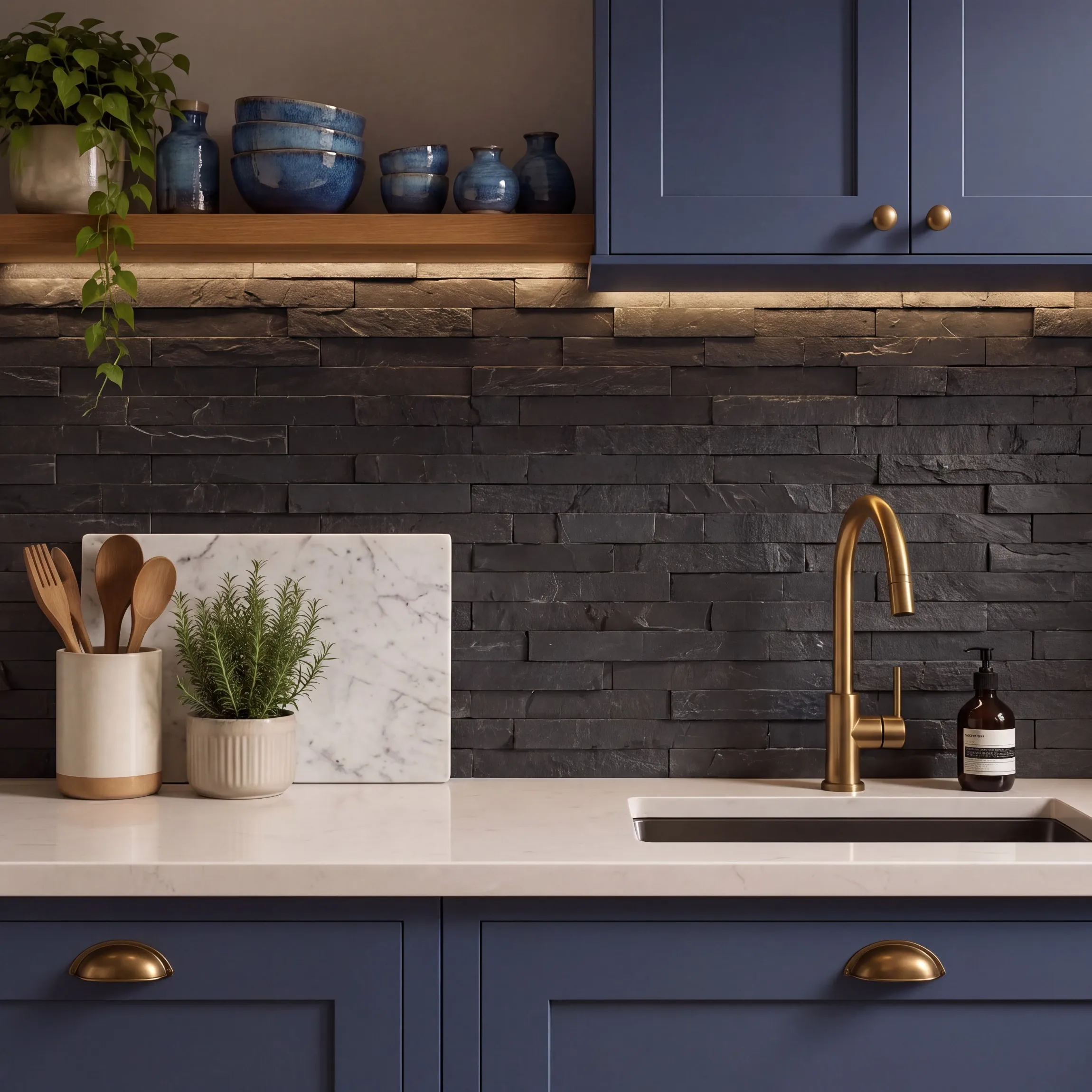
Anthracite is a deep grey colour positioned between charcoal and black, often featuring cool blue, green or neutral undertones. Lighting, surface texture and material finish influence whether anthracite appears distinctly grey or almost black. Across wall tiles, floor tiles, cabinetry and exterior features, the dark neutral creates contrast without the visual intensity of pure black. Understanding anthracite colour involves comparing undertones, complementary colours, natural wood pairings, indoor and outdoor applications, and practical maintenance requirements. The Walls and Floors guide explains how to select and use anthracite across kitchens, bathrooms, living spaces, hallways and patios.
Table of Contents
What Is Anthracite Colour?
Anthracite colour is a deep, sophisticated grey positioned between charcoal and black. The shade takes its name from anthracite coal and usually carries cool blue, green or neutral undertones, creating greater softness and tonal variation than pure black.
Anthracite belongs to the dark-grey colour family rather than the black colour family. Greater pigment depth produces a strong architectural appearance, while subtle grey undertones prevent the flat intensity associated with solid black.
Light, material and surface finish influence the final appearance. Matt anthracite tiles create a soft, understated surface, while polished or gloss finishes produce deeper shadows and brighter reflections. Anthracite wall and floor tiles often appear lighter in direct daylight and almost black under low artificial lighting.
Is Anthracite Grey or Black?
Anthracite is a very dark grey, not a true black. Anthracite retains visible grey undertones and softer tonal variation, while black creates a deeper, more uniform appearance with stronger contrast against surrounding colours, materials and architectural features.
Anthracite occupies the darkest area of the grey spectrum and often appears close to black under subdued lighting. Brighter daylight reveals the underlying grey character and subtle blue, green or neutral notes.
The distinction becomes clearer across larger surfaces. Anthracite wall and floor tiles provide depth without the visual severity of solid black, making the shade suitable for contemporary bathrooms, kitchens, hallways and open-plan living spaces.

Does Anthracite Have Blue, Green or Brown Undertones?
Anthracite commonly has blue, green or neutral undertones, although warmer variations contain subtle brown notes. Pigment composition, surface material, finish and surrounding colours determine which undertone becomes most visible within an interior design scheme.
Blue undertones create a cooler, sharper appearance alongside white, silver and pale grey. Green undertones introduce an earthy quality that coordinates with stone, sage, olive and natural timber. Brown undertones produce a warmer anthracite shade suited to beige, cream, taupe and wood-effect surfaces.
Nearby materials also change colour perception. Cool lighting strengthens blue and green notes, while warm lighting emphasises brown and neutral tones. Physical tile samples should be viewed beside cabinetry, worktops, paint colours and furnishings before making a final selection.
Does Anthracite Have a Standard Colour Code?
Anthracite has no single universal hex, RGB or CMYK colour code because the shade varies between manufacturers, materials and finishes. RAL 7016 Anthracite Grey provides the most widely recognised standard reference for architectural surfaces and exterior fittings.
RAL 7016 belongs to the RAL Classic colour system and commonly appears across window frames, doors, radiators, cladding and metalwork. A tile, paint or furnishing described as anthracite does not automatically match RAL 7016.
Digital hex and RGB values only provide approximate screen representations. Display calibration, brightness and colour profiles alter the visible result. Matt, gloss, polished and textured finishes also make the same colour reference appear lighter, darker or more reflective.
Compare physical samples when matching anthracite tiles with RAL 7016 doors, windows or fittings. Physical comparison provides greater accuracy than online colour charts or converted digital codes.
How Do Natural and Artificial Lighting Affect Anthracite?
Natural and artificial lighting change the perceived depth, temperature and undertone of anthracite. Strong daylight reveals the grey character and surface detail, while limited or warm lighting produces a deeper appearance that often moves closer to black.
Window direction affects anthracite throughout the day:
- North-facing rooms: Cooler, indirect daylight strengthens blue or green undertones and creates a deeper grey appearance.
- South-facing rooms: Stronger daylight reveals more tonal variation and prevents large anthracite surfaces from appearing overly heavy.
- East-facing rooms: Morning daylight highlights surface texture and undertones, while reduced afternoon light creates a darker finish.
- West-facing rooms: Lower morning light produces greater depth, while warm afternoon and evening light softens the dark grey.
- Windowless rooms: Artificial lighting determines almost the entire colour reading and requires careful placement.
Artificial light temperature also influences anthracite:
- Warm white, 2,700K–3,000K: Softens the colour and emphasises neutral or brown undertones.
- Neutral white, 3,500K–4,000K: Produces a balanced representation of anthracite grey.
- Cool white, above 5,000K: Strengthens blue or green undertones and creates a sharper appearance.
Surface finish changes the lighting response. Gloss and polished anthracite tiles produce stronger reflections, while matt and textured tiles absorb more light and create a softer, more uniform surface. Review physical samples under the room’s daylight and permanent artificial lighting before installation.
Why Does Anthracite Look Different in Photographs and Online?
Anthracite looks different online because photography, image processing and screen settings alter the displayed colour. Digital images rarely reproduce the precise depth, undertone, texture and light reflection of a physical anthracite wall tile, floor tile or surface.
Several factors change the digital appearance of anthracite:
- Camera exposure: Bright exposure makes anthracite appear lighter, while low exposure creates a near-black appearance.
- White balance: Camera settings strengthen or reduce blue, green and brown undertones.
- Studio lighting: Artificial light changes colour temperature, shadows and surface reflections.
- Image editing: Filters, contrast adjustments and colour correction modify the original shade.
- Screen calibration: Display settings affect brightness, saturation and tonal accuracy.
- Device type: Phones, tablets, laptops and monitors reproduce colours differently.
- Surface finish: Gloss, matt and textured anthracite surfaces reflect light differently.
- Surrounding colours: White, beige, wood and dark furnishings influence perceived colour depth.
A physical sample viewed inside the intended room provides the most reliable representation of anthracite colour.
Why Is Anthracite Colour Popular in Interior Design?
Anthracite colour is trending because the near-black grey creates architectural definition without the harshness of solid black. The shade coordinates with contemporary tiles, natural materials and dark exterior fittings, producing a consistent colour scheme across indoor and outdoor spaces.
Anthracite reflects the shift from uniform pale-grey interiors towards deeper, layered colour palettes. Oak, walnut, limestone, marble, beige and brushed brass introduce warmth, while anthracite provides contrast and structure. The balanced combination suits contemporary, industrial, minimalist and modern-rustic interiors.
Material flexibility also supports the growing popularity of anthracite. Porcelain tiles, ceramic tiles, cabinetry, radiators, window frames and patio surfaces all use the colour effectively. Repeating anthracite across kitchens, bathrooms, hallways and gardens creates visual continuity without making every surface identical.

How Can You Use Anthracite Without Making a Room Feel Dark?
Use anthracite as a controlled grounding colour and balance the dark surface with pale walls, warm materials, reflective finishes and layered lighting. Careful placement preserves visual depth while preventing anthracite tiles, furniture and architectural features from dominating the room.
The following design choices keep an anthracite interior bright and balanced:
- Limit the surface area: Use anthracite across a floor, splashback, shower enclosure or feature wall rather than covering every surface.
- Choose pale surrounding colours: Pair anthracite with off-white, cream, beige, pale greige or light taupe.
- Introduce natural warmth: Add oak, walnut, warm stone, rattan or brushed brass to soften the dark grey.
- Use large-format tiles: Larger anthracite tiles reduce grout lines and create a cleaner, more continuous surface.
- Select tonal grout: Mid-grey or anthracite grout prevents a contrasting grid from visually dividing the room.
- Reflect available light: Include mirrors, glass screens, polished details or satin finishes within compact spaces.
- Layer artificial lighting: Combine ceiling lights, wall lights, illuminated mirrors and under-cabinet lighting.
- Keep the ceiling light: White or warm off-white ceilings preserve height and distribute light more effectively.
- Test physical samples: Review anthracite tiles during morning, afternoon and evening before final selection.
What Neutral Colours Work Best With Anthracite?
Warm white, ivory, beige, greige, taupe, pale grey and natural stone shades work best with anthracite. Lighter neutrals balance the depth of dark grey, while warmer undertones prevent kitchens, bathrooms and living spaces from appearing cold or visually heavy.
Each neutral colour creates a different relationship with anthracite:
- Warm white: Produces clean contrast without the stark appearance of brilliant white.
- Ivory and cream: Add softness and suit bathrooms or kitchens with warm lighting and traditional details.
- Beige: Introduces natural warmth and coordinates with limestone, travertine and sand effect tiles.
- Greige: Connects grey and beige surfaces through a balanced warm-neutral transition.
- Taupe: Creates a sophisticated tonal scheme with greater depth than beige or cream.
- Pale grey: Supports a modern monochromatic palette while preserving contrast between adjoining surfaces.
- Natural stone: Adds organic pattern and texture through marble, limestone, terrazzo or concrete-effect finishes.
Warm anthracite shades coordinate best with cream, beige and taupe. Cool anthracite shades coordinate more naturally with crisp white, pale grey and blue-based stone colours. Physical samples reveal undertone compatibility more accurately than digital swatches.
Does Anthracite Work With Natural Wood Tones?
Anthracite works exceptionally well with natural wood tones because warm timber grain softens the cool depth of dark grey. The combination creates clear contrast, adds organic texture and suits contemporary, industrial, Scandinavian and modern-rustic interior styles.
Different wood tones produce distinct design effects:
- Pale oak: Creates fresh contrast and keeps anthracite kitchens, bathrooms and living spaces visually light.
- Honey oak: Adds golden warmth and complements anthracite with blue, green or neutral undertones.
- Walnut: Produces a richer, more luxurious scheme through deep brown grain and subtle tonal contrast.
- Ash: Supports a clean Scandinavian-style palette with light grain and understated warmth.
- Reclaimed timber: Adds texture and character to industrial interiors featuring anthracite tiles or metalwork.
- Dark-stained wood: Creates a dramatic tonal scheme suited to larger, well-lit rooms.
Undertone consistency remains important. Cool anthracite pairs naturally with pale oak and ash, while warmer anthracite coordinates with walnut, honey oak and reclaimed timber. Repeating the same wood tone across cabinetry, shelving or furniture creates a unified finish.
Anthracite vs Charcoal: What Is the Difference?
Anthracite is generally darker, cooler and closer to black than charcoal. Charcoal usually has a softer mid-to-dark grey appearance with warmer undertones, while anthracite creates stronger contrast and a more architectural finish across interior and exterior surfaces.
The main differences concern colour depth, undertone and visual character:
| Feature | Anthracite | Charcoal |
| Colour depth | Very dark grey | Mid-to-dark grey |
| Typical undertone | Blue, green or neutral | Neutral, brown or warm grey |
| Visual character | Sharp, structured and architectural | Soft, muted and understated |
| Natural reference | Anthracite coal | Burnt wood charcoal |
| Colour standard | Often associated with RAL 7016 Anthracite Grey, although generic anthracite shades vary | No single widely recognised standard colour reference |
| Overall effect | Strong contrast and near-black depth | Gentler contrast and visible grey softness |
Commercial colour names remain inconsistent between manufacturers. Some charcoal products appear darker than anthracite products because pigment, material and finish affect the final shade. Physical samples provide the most accurate comparison for wall tiles, floor tiles and adjoining surfaces.

Where Can Anthracite Tiles Be Used in the Home?
Anthracite tiles suit bathrooms, kitchens, hallways, living rooms, utility rooms and selected bedrooms. The dark grey surface works across floors, feature walls, splashbacks and shower areas when the tile material, finish and technical specification match the intended location.
Each room requires a different balance of appearance and practical performance:
| Room | Suitable application | Main consideration |
| Bathroom | Shower wall, splashback, feature wall or floor | Slip resistance, lighting and visible limescale |
| Kitchen | Floor, splashback, feature wall or island surround | Cleaning, grease marks and surface finish |
| Hallway | Floor tiles or lower wall protection | Durability, available light and pale dust |
| Living room | Fireplace surround, feature wall or floor | Balance with furniture, textiles and natural wood |
| Utility room | Floor, splashback or wall tiles | Moisture resistance and easy maintenance |
| Bedroom | Feature wall or limited floor area | Soft lighting and warm complementary colours |
| Conservatory | Floor tiles | Sunlight, temperature changes and glare |
Porcelain anthracite tiles often suit demanding floors because dense construction provides low water absorption and strong wear resistance. Ceramic anthracite tiles commonly suit interior walls and lighter-duty applications. Individual product specifications determine exact suitability.
Check floor classification, slip resistance, water exposure, underfloor-heating compatibility and installation requirements before selection. Matching anthracite wall and floor surfaces through colour rather than identical finishes creates continuity while preserving the practical performance required in each area.
Can Anthracite Be Used Outdoors?
Anthracite is suitable for patios, paths, steps, exterior walls and architectural fittings when the chosen material carries an outdoor-use specification. The dark grey colour creates a contemporary finish and coordinates naturally with brick, timber, concrete, stone and greenery.
Outdoor suitability depends on product performance rather than colour alone. Check the following specifications before selection:
- Frost resistance: Exterior tiles require protection against freeze-and-thaw damage during cold weather.
- Low water absorption: Outdoor porcelain commonly provides lower water absorption than standard ceramic products.
- Slip resistance: Patios, paths and steps require a textured surface designed for wet external conditions.
- Weather resistance: Exterior finishes require resistance to rain, temperature changes and prolonged sunlight.
- Installation method: Correct adhesives, grout, drainage and substrate preparation support long-term performance.
- Maintenance needs: Pale dust, mineral deposits and dried rain marks remain more visible against dark surfaces.
Anthracite paving also creates continuity between interior floor tiles and adjoining garden areas. Matching colour families rather than exact shades produces a more natural transition across indoor and outdoor surfaces.
What Grout Colour Works Best With Anthracite Tiles?
Anthracite, dark grey and mid-grey grout colours work best with anthracite tiles. Darker grout creates a continuous surface, while lighter grout defines each tile and makes the laying pattern more visible across walls and floors.
The best grout colour depends on the required level of contrast:
- Anthracite grout: Produces the most seamless appearance and allows tile colour, pattern and texture to remain dominant.
- Dark-grey grout: Creates slight definition without introducing a strong contrasting grid.
- Mid-grey grout: Balances visual separation with practical maintenance across kitchens, bathrooms and hallways.
- Light-grey grout: Highlights tile shape, format and laying pattern without the intensity of white.
- White grout: Creates maximum contrast but makes every joint prominent and requires more frequent cleaning.
Tile format and edge finish also influence the result. Rectified anthracite tiles with narrow, tonal grout joints create a clean and continuous surface. Smaller tiles, mosaics and patterned layouts often benefit from a contrasting grout colour that emphasises individual shapes.
Grout often appears different after drying than during application. Compare a cured grout sample beside the anthracite tile under the room’s natural and artificial lighting before installation.
What Are the Advantages and Disadvantages of Anthracite?
Anthracite provides strong contrast, architectural depth and broad colour compatibility, although the dark grey shade requires careful lighting, proportion and maintenance. Room size, surface finish, surrounding materials and natural light determine whether anthracite creates a balanced or overly heavy result.
The main advantages of anthracite include:
- Versatile colour pairing: Anthracite coordinates with warm white, beige, greige, natural wood, stone and metallic finishes.
- Softer than black: Visible grey undertones create depth without the absolute intensity of pure black.
- Architectural definition: Dark surfaces emphasise tile layouts, cabinetry, doors, windows and structural details.
- Broad design compatibility: Anthracite suits contemporary, industrial, minimalist and modern-rustic interiors.
- Indoor-outdoor continuity: Similar colour families connect interior floor tiles with patios and external features.
- Varied surface options: Matt, gloss, polished, textured, stone-effect and concrete-effect finishes create different visual results.
The main disadvantages of anthracite include:
- Reduced perceived brightness: Large anthracite surfaces create a heavier atmosphere in poorly lit rooms.
- Visible pale residue: Dust, pet hair, limescale, soap deposits and dried water marks stand out against dark grey.
- Inconsistent colour matching: Anthracite shades vary between manufacturers, materials and production batches.
- Undertone conflicts: Blue, green or brown notes sometimes clash with adjoining greys and neutral colours.
- Greater heat absorption: Dark outdoor surfaces become warmer under prolonged direct sunlight.
- Strong visual weight: Excessive anthracite across floors, walls, furniture and ceilings overwhelms compact spaces.
How Do You Choose the Best Anthracite Colour for Your Room?
Choose the best anthracite colour by comparing room size, natural light, artificial lighting, undertone, surface finish, existing materials and maintenance requirements. A physical sample provides the most accurate indication of colour depth across different times of day.
Seven factors support an informed anthracite colour choice:
- Assess room size: Compact rooms benefit from controlled anthracite accents, while larger spaces support broader dark surfaces.
- Check natural light: Bright rooms reveal grey undertones, whereas low-light rooms produce a deeper near-black appearance.
- Review artificial lighting: Warm-white bulbs soften anthracite, while cool-white bulbs emphasise blue and green notes.
- Match the undertone: Cool anthracite suits crisp white and pale grey; warm anthracite complements cream, beige and wood.
- Select the finish: Matt surfaces create a soft appearance, gloss surfaces increase reflection and textured surfaces add depth.
- Compare fixed materials: Check anthracite beside cabinetry, worktops, sanitaryware, furniture, metal fittings and adjoining tiles.
- Consider maintenance: Uniform dark surfaces show pale dust, limescale, soap residue and dried water marks more clearly.
Review the sample vertically for wall applications and horizontally for flooring applications. Different angles receive different light levels and often produce noticeably different colour readings.
What Common Mistakes Should Be Avoided When Using Anthracite?
Common anthracite mistakes include selecting colours from screens, covering too many surfaces, ignoring undertones and relying on insufficient lighting. Poor grout choices, mismatched materials and overlooked maintenance requirements also weaken the balance and consistency of a dark-grey interior.
Avoid the following mistakes when planning an anthracite colour scheme:
- Choosing from online images alone: Screen settings, photography and editing rarely reproduce the exact colour.
- Assuming every anthracite matches: Shades vary between RAL 7016, tile ranges, paint colours, metals and production batches.
- Using anthracite on every surface: Dark floors, walls, ceilings and furniture create excessive visual weight.
- Ignoring colour undertones: Blue, green and brown notes affect compatibility with paint, wood, stone and furnishings.
- Relying on one light source: Limited lighting creates heavy shadows and hides the grey character of anthracite.
- Selecting grout without testing: White grout forms a strong grid, while matching grey grout creates a continuous surface.
- Mixing unrelated dark greys: Slightly different charcoal, graphite and anthracite shades often look accidental together.
- Overlooking maintenance: Pale dust, limescale, soap deposits and dried water marks remain visible on uniform dark surfaces.
- Ignoring product suitability: Bathroom floors and outdoor areas require appropriate slip resistance, water resistance and installation specifications.
- Ordering separate production batches: Batch variation produces noticeable colour differences across adjoining tiles.
Conclusion
Anthracite suits homes requiring a dark neutral with greater softness and tonal variation than black. The colour works particularly well across wall tiles, floor tiles and architectural details when balanced with suitable lighting, pale shades and warm natural materials.
Successful anthracite schemes depend on proportion, undertone and surface finish. Warm white, beige, natural wood and brushed metals soften the dark grey, while matt, gloss and textured finishes produce different levels of reflection and visual depth.
Bathrooms, kitchens, hallways, living spaces and patios all support anthracite when the selected material meets the practical requirements of each location. At Walls and Floors, we recommend comparing physical tile samples under the room’s natural and artificial lighting before making a final selection.
