
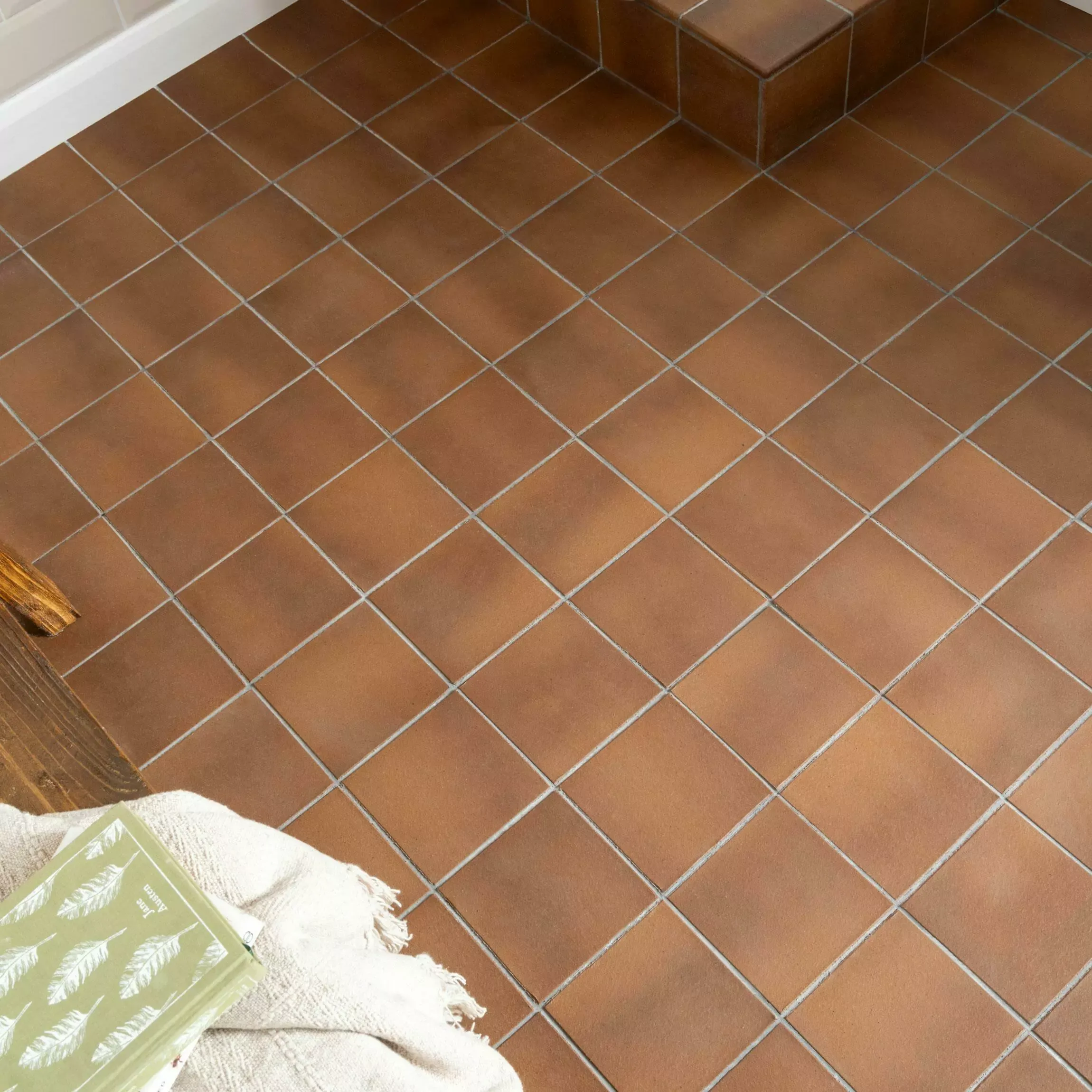
Terracotta color ranges from pale peach and burnt orange to brick red and brown. Explore tile colour combinations, styling ideas and room-by-room advice.
Terracotta tile colours range from pale peach and soft salmon to burnt orange, brick red, earthy brown and smoky grey. Clay composition, firing conditions, surface finish and sealing treatment create the distinctive tonal variation associated with natural terracotta.
Choosing a suitable shade requires consideration of room size, lighting, grout, surrounding materials and interior style. The Walls and Floors guide explains terracotta colour variations, complementary palettes, room-specific choices, maintenance requirements and common selection mistakes.
Table of Contents
What Does Terracotta Look Like?
Terracotta has a warm, earthy appearance characterised by burnt orange, clay red, soft brown, peach and muted pink tones. Natural terracotta tiles often display subtle shade variation, textured surfaces, uneven edges and mineral markings created during clay firing.
Terracotta tile colours depend on clay composition, firing temperature and surface finish. Iron-rich clay produces traditional orange and red shades, while different mineral levels create pale peach, deep brown, yellow or smoky grey undertones.
Handmade terracotta usually has small pits, softened edges and visible tonal differences. Machine-made terracotta provides a more uniform shape and colour. Matt surfaces create a dry, rustic appearance, while sealing or polishing deepens the colour and produces a richer finish.

Why Do Terracotta Tiles Have Different Colours?
Terracotta tiles have different colours because clay composition, mineral content, firing temperature, kiln atmosphere and surface treatments affect the finished shade. Natural variations produce colours ranging from pale peach and burnt orange to brick red, earthy brown and smoky grey.
- Clay composition: Different clay deposits contain distinct mineral combinations, creating regional colour variations.
- Iron content: Iron-rich clay produces traditional burnt orange, rust and brick-red shades.
- Mineral content: Manganese and other minerals introduce brown, purple, yellow or grey undertones.
- Firing temperature: Higher kiln temperatures often produce deeper, richer terracotta tile colours.
- Kiln atmosphere: Oxygen levels during firing influence red, brown and smoky colour development.
- Kiln position: Individual tiles receive different levels of heat, creating natural shade variation.
- Production method: Handmade terracotta generally displays greater tonal variation than machine-made tiles.
- Surface treatment: Sealers, waxes and polishes deepen colour, while natural-look finishes preserve a lighter, matt appearance.
How Much Colour Variation Do Terracotta Tiles Have?
Terracotta tiles often have moderate to substantial colour variation. Natural and handmade tiles contain visible differences in shade, undertone, texture and mineral markings, while machine-made terracotta and terracotta-effect porcelain generally provide greater colour consistency.
Natural terracotta tile colours range from pale peach and burnt orange to brick red and earthy brown. Clay composition, kiln temperature and tile position during firing determine the final shade. Handmade production creates further differences in edges, dimensions and surface texture.
Manufacturers often describe colour variation through four ratings:
- V1: Uniform appearance with minimal variation.
- V2: Slight differences between individual tiles.
- V3: Noticeable variation in colour and texture.
- V4: Substantial variation across the finished surface.
Natural terracotta commonly carries a V3 or V4 rating, although ratings vary between collections. Tiles from several boxes should be mixed before installation to distribute light, medium and dark shades evenly.
What Is the Difference Between Natural Terracotta and Terracotta-Effect Tile Colours?
Natural terracotta develops colour from minerals within fired clay, creating organic variations across every tile. Terracotta-effect tiles reproduce clay shades through printed or glazed ceramic and porcelain surfaces, providing more consistent colours, patterns and finishes across an installation.
Natural terracotta tile colours include peach, burnt orange, rust, brick red and earthy brown. Kiln temperature, clay composition and mineral content create irregular tonal changes, darker edges and distinctive surface markings. Sealing often deepens the original colour.
Terracotta-effect tiles use digital printing to replicate fired-clay colours and textures. Manufacturers control the shade range, pattern distribution and finish, although multiple printed faces prevent excessive repetition.
- Natural terracotta: Greater shade variation, unique markings, changing patina and richer colour after sealing.
- Terracotta-effect tiles: Greater colour consistency, predictable patterns and no colour change from sealing.

How Does Grout Colour Change the Appearance of Terracotta Tiles?
Grout colour changes the contrast, pattern definition and visual continuity of terracotta tiles. Matching grout creates a unified surface, while contrasting grout highlights individual tile shapes, joint widths and layouts such as herringbone, brick bond and basketweave.
Which Grout Colours Work With Terracotta Tiles?
- Cream grout: Brightens the surface and defines individual tiles.
- Warm beige grout: Creates a soft transition between peach, orange and red shades.
- Terracotta grout: Blends with traditional burnt-orange and brick-red tiles.
- Brown grout: Complements darker clay tones and disguises everyday marks.
- Warm grey grout: Introduces restrained contrast within contemporary interiors.
- Charcoal grout: Emphasises geometric shapes and patterned layouts.
Should Grout Match or Contrast With Terracotta Tiles?
Matching grout allows natural shade variation to remain the main visual feature. Warm beige, sand and light brown shades often create a cohesive appearance across varied terracotta floors.
Contrasting grout creates stronger outlines around each tile. Cream or charcoal grout draws attention to hexagonal, herringbone and brick-bond layouts. Narrow joints produce subtle definition, while wider joints create a more rustic appearance.
Why Should Grout Be Tested Before Installation?
Grout should be tested beside sealed terracotta because sealers often deepen peach, orange, red and brown tones. Natural terracotta may also require sealing before grouting to reduce pigment absorption and surface staining. Manufacturer instructions should determine the sealing and grouting sequence.
Which Materials Coordinate With Terracotta Tile Colours?
Terracotta tile colours coordinate with timber, natural stone, plaster, brick, concrete, metal and woven fibres. Warm materials create a cohesive earthy palette, while pale stone, dark metal and cool concrete introduce controlled contrast.
Natural Materials
Natural materials reflect the organic colour and texture of fired clay:
- Pale oak: Complements peach, salmon and light-orange terracotta.
- Medium oak: Balances burnt-orange, rust and brick-red shades.
- Walnut: Adds depth beside red and brown terracotta.
- Limestone: Creates a soft transition between cream and pale clay tones.
- Travertine: Repeats beige, honey and warm stone undertones.
- Slate: Produces dark contrast against orange and red tiles.
- Rattan and jute: Add texture without introducing competing colours.
Wall Materials
Limewash and clay plaster complement the tonal variation of natural terracotta. Smooth painted plaster creates a cleaner background for contemporary interiors. Exposed brick produces a layered, rustic finish when both materials share warm undertones.
Warm white, cream, sage green and dusty blue wall finishes balance traditional orange and red terracotta tile colours.
Contemporary Materials
Modern materials create contrast against the aged appearance of fired clay:
- Polished concrete: Balances warm terracotta with a cooler grey surface.
- White marble: Brightens dark red and brown tiles.
- Fluted glass: Introduces light and texture without adding a dominant colour.
- Matt black metal: Defines furniture, doors and lighting against orange terracotta.
- Brushed nickel: Creates a restrained, cool-toned accent.
Metal Finishes
Aged brass, copper and bronze reinforce warm clay shades. Matt black creates stronger contrast, while brushed nickel provides a cooler contemporary finish. One consistent metal finish generally produces a more balanced scheme than several competing finishes.
Fabrics and Soft Textures
Linen, wool, cotton and leather soften the hard surface of terracotta tiles. Cream and beige textiles lighten deep red or brown floors. Olive, navy and charcoal fabrics introduce contrast, while rust and ochre fabrics create a layered tonal palette.

What Colours Go with Terracotta Tiles?
Terracotta tiles coordinate with warm white, cream, beige, sage green, olive, navy blue, dusty pink, charcoal and earthy brown. The strongest combinations either repeat warm clay undertones or create balanced contrast through cooler and darker shades.
Warm Neutrals
Warm neutrals allow orange, red and brown terracotta tile colours to remain the main feature:
- Warm white: Creates a clean contrast without appearing harsh.
- Cream: Softens dark red and brown terracotta.
- Beige: Supports a calm, earthy colour palette.
- Greige: Introduces contemporary balance through warm grey undertones.
- Taupe: Complements brown and muted terracotta shades.
Bright blue-white can make warm terracotta appear excessively orange. Warm white generally creates a more balanced transition.
Green Shades
Green provides natural contrast because green sits opposite red within the colour wheel:
- Sage green: Complements pale peach and burnt-orange tiles.
- Olive green: Supports Mediterranean and rustic interiors.
- Forest green: Creates depth beside light or mid-tone terracotta.
- Eucalyptus green: Produces a softer contemporary combination.
Blue Shades
Blue balances the warmth of orange and red terracotta:
- Navy blue: Creates a strong contrast in kitchens and bathrooms.
- Dusty blue: Softens traditional brick-red floors.
- Teal: Adds depth beside copper and burnt-orange shades.
- Sky blue: Supports bright Mediterranean-inspired interiors.
Tonal Earth Colours
Related earth colours create a layered, cohesive scheme:
- Ochre: Repeats golden undertones within pale terracotta.
- Rust: Deepens a burnt-orange colour palette.
- Dusty pink: Complements peach and salmon tiles.
- Chocolate brown: Grounds pale clay shades.
- Burgundy: Adds richness beside red terracotta.
Dark Accent Colours
Charcoal, black and deep brown introduce definition around terracotta floors and walls. Dark accents work particularly well across cabinetry, furniture, doors and decorative details. Larger amounts require sufficient natural or artificial light to prevent a heavy appearance.
Room orientation, lighting temperature, grout colour and tile finish affect every colour combination. Paint samples should be viewed beside the terracotta tiles during morning, afternoon and evening light.
Which Terracotta Tile Colour Combinations Work Best?
The best terracotta tile colour combinations pair warm clay shades with soft neutrals, muted greens, deep blues or controlled dark accents. Room size, daylight, tile undertone and desired interior style determine the most balanced palette.
The following combinations connect terracotta tile colours with suitable wall shades, accents and interior styles:
| Terracotta tile colour | Main coordinating colour | Accent colour | Suitable interior style |
| Pale peach | Warm white | Sage green | Contemporary Mediterranean |
| Soft salmon | Cream | Aged pink | Relaxed traditional |
| Burnt orange | Off-white | Navy blue | Modern rustic |
| Brick red | Chalky white | Olive green | Farmhouse |
| Rust | Warm beige | Charcoal | Industrial rustic |
| Earthy brown | Greige | Matt black | Contemporary |
| Rose clay | Plaster pink | Burgundy | Tonal decorative |
| Golden terracotta | Cream | Deep blue | Spanish-inspired |
| Mixed terracotta | Limewash white | Forest green | Mediterranean |
| Charcoal terracotta | Ivory | Burnt orange | Modern industrial |
Low Contrast Combinations
Pale peach with cream, burnt orange with warm beige, and earthy brown with taupe create soft transitions. Low-contrast palettes emphasise natural texture and help tiled surfaces appear more continuous.
Complementary Combinations
Burnt orange with navy, brick red with sage green, and golden terracotta with deep blue create controlled colour contrast. Complementary palettes highlight the warmth of terracotta without repeating orange or red across every surface.
Tonal Combinations
Terracotta, rust, ochre, dusty pink and brown form a layered earth-colour palette. Tonal schemes require differences in shade depth and texture to prevent a flat or overly saturated appearance.
High Contrast Combinations
Terracotta with warm white, charcoal or matt black creates strong visual definition. High-contrast palettes suit geometric layouts, contemporary kitchens and decorative walls. Adequate lighting prevents darker accents from overwhelming compact rooms.
Which Terracotta Colours Work Best in Different Rooms?
Pale terracotta brightens compact bathrooms, mid-tone orange and red suit busy kitchens and hallways, while deeper brown and mixed clay shades ground larger living spaces. Daylight, room size, surrounding finishes and maintenance requirements should guide the final selection.
Kitchens
Burnt orange, brick red and earthy brown create practical kitchen floors with a warm, grounded appearance. Mixed mid-tones make crumbs, dust and minor marks less noticeable than uniform pale or very dark surfaces.
Pale peach terracotta works well with cream, sage or natural oak cabinetry. Dark red and brown tiles create stronger contrast beside warm white units and pale worktops.
Bathrooms
Pale peach, salmon and muted pink terracotta create a light, relaxed bathroom palette. Deep red and brown shades suit larger bathrooms or compact cloakrooms designed around dramatic colour.
Warm white sanitaryware provides a clean contrast. Natural terracotta requires suitable sealing, while every bathroom tile requires confirmation of wet-area and floor suitability.
Living Rooms
Orange, rust and medium-brown terracotta create warmth across living-room floors. Pale clay shades support contemporary interiors, while mixed red and brown tiles complement rustic or period settings.
Cream walls, timber furniture and neutral rugs soften stronger tile colours. Navy, olive and charcoal accents add controlled contrast.
Hallways
Brick red, rust and mixed brown terracotta suit busy hallways because tonal variation disguises everyday dust and minor marks. Darker shades also create a strong visual connection with traditional entrance spaces.
Consistent flooring across adjoining rooms increases visual continuity. Adequate entrance lighting prevents deep brown or red tiles from making a narrow hallway feel enclosed.
Dining Rooms
Warm orange, red and brown terracotta create a welcoming dining area. Medium shades coordinate easily with oak, walnut, black metal and warm neutral walls.
Large dining rooms accommodate stronger colour variation, while smaller rooms benefit from pale terracotta and low-contrast grout.
Bedrooms
Pale peach, blush and soft salmon terracotta produce a calmer bedroom palette than saturated orange or deep red. Cream, dusty green and muted blue textiles balance the warmth of fired-clay colours.
Rugs add softness and reduce the visual weight of large tiled areas.
Conservatories
Mixed peach, orange and brown terracotta connects indoor surfaces with garden colours. Mid-tone shades also respond well to changing daylight throughout the day.
Flooring specifications should confirm suitability for strong sunlight, temperature changes and the intended installation system.
Outdoor Spaces
Burnt orange, brick red and earthy brown create a traditional patio or courtyard appearance. Pale peach and sand shades support brighter Mediterranean-inspired gardens, while charcoal and deep brown suit contemporary landscaping.
Outdoor selection requires frost-resistant, slip-resistant and weather-suitable tiles. Colour alone does not determine exterior performance.

Which Colours Are Best Avoided with Terracotta Tiles?
Cold blue-whites, icy greys, neon shades and highly saturated reds or oranges often clash with the warm undertones of terracotta tiles. Balanced results depend on matching undertones, controlling colour intensity and testing every shade beside the tiles under room lighting.
Cold Whites
Brilliant whites with blue undertones can make orange and red terracotta appear excessively warm. Soft white, ivory and cream create a gentler transition and retain the earthy character of fired clay.
Blue-Based Greys
Pale silver and icy grey can appear disconnected from peach, rust and brick-red tiles. Warm grey, greige, mushroom and taupe provide greater tonal balance.
Neon Colours
Fluorescent yellow, green, pink and orange compete with the natural variation of terracotta. Muted alternatives such as ochre, sage, dusty pink and olive create clearer visual harmony.
Saturated Warm Shades
Large areas of vivid orange, scarlet or bright red can overwhelm a room containing terracotta floors or walls. Deeper rust, burgundy and muted clay shades create tonal variation without duplicating the tile colour.
Conflicting Brown Undertones
Cool espresso brown can look disconnected beside red-orange terracotta. Chestnut, walnut and warm chocolate shades repeat the natural undertones more effectively.
Excessive Colour Mixtures
Several strong colours used together can compete with varied terracotta tiles. A balanced scheme normally contains:
- One dominant neutral
- One supporting colour
- One darker or brighter accent
- Repeated natural materials for visual continuity
No colour requires complete exclusion. Sample testing remains essential because daylight, artificial lighting, grout and tile finish change the appearance of every combination.
How Do You Style Terracotta Tiles in Your Home?
Style terracotta tiles with warm neutrals, natural materials, restrained accent colours and layered textures. Balanced interiors allow the tiles to provide warmth and character while surrounding walls, furniture, textiles and lighting support the chosen clay undertone.
Balanced Colour Palette
Select one dominant neutral, one supporting colour and one accent shade. Warm white, cream, beige and greige create a calm background. Sage green, navy blue, dusty pink or charcoal add controlled contrast.
Avoid repeating saturated orange across every surface. Terracotta floors already provide a strong warm foundation.
Natural Materials
Natural textures complement the earthy appearance of fired clay:
- Pale or medium oak for light and balanced schemes
- Walnut for deeper red and brown terracotta
- Limestone and travertine for tonal contrast
- Rattan, jute and linen for Mediterranean styling
- Aged brass, copper or bronze for warm metallic detail
- Matt black metal for contemporary definition
Simple Wall Treatments
Limewash, clay plaster and warm matt paint complement natural terracotta variation. Smooth warm-white walls create a cleaner contemporary finish, while exposed brick supports rustic and period interiors.
Strongly patterned wallpaper works best on one feature wall rather than across the entire room.
Layered Soft Furnishings
Rugs, curtains and upholstered furniture soften tiled floors and improve visual balance. Cream, olive, navy and charcoal textiles contrast with burnt-orange and red terracotta. Rust, ochre and dusty pink create a richer tonal scheme.
Natural linen, wool, cotton and leather reinforce the tactile character of terracotta.
Coordinated Furniture
Simple furniture shapes prevent detailed or heavily varied tiles from overwhelming a room. Timber furniture complements rustic schemes, while black-framed furniture creates a modern contrast.
Large rooms accommodate dark wood and stronger colours. Compact rooms benefit from pale furniture, raised legs and lighter wall finishes.
Considered Tile Layout
Tile layout changes the strength of the finished design:
- Straight lay: Creates a simple and balanced surface.
- Brick bond: Supports traditional and rustic interiors.
- Herringbone: Adds movement and stronger pattern definition.
- Hexagonal layout: Introduces geometric character.
- Mixed-format layout: Creates an aged Mediterranean appearance.
Matching grout produces a continuous floor, while contrasting grout highlights the laying pattern.
Layered Lighting
Warm-white lighting around 2700K–3000K enhances orange, red and brown clay tones. Wall lights, pendants and floor lamps create greater depth than one central ceiling light.
Tile and paint samples require assessment during morning, afternoon and evening conditions because changing light alters colour intensity.
How Can Terracotta Tile Colour Make a Room Look Larger?
Pale peach, buff and soft salmon terracotta tiles make a room look larger by reflecting more light and reducing visual weight. Low-contrast grout, simple layouts and continuous flooring further reduce boundaries across compact kitchens, bathrooms and hallways.
Lighter Terracotta Colours
Pale terracotta colours create a brighter and more open appearance than deep red or dark brown. Suitable shades include:
- Pale peach
- Soft salmon
- Light clay
- Warm sand
- Muted apricot
- Creamy terracotta
Warm white or cream walls extend the lighter palette and increase visual continuity.
Low Contrast Grout
Grout close to the main tile colour prevents strong lines from dividing the surface. Sand, warm beige and pale terracotta grout work well with lighter clay shades.
Dark contrasting grout emphasises every tile edge and creates a busier appearance. Strong contrast suits decorative layouts but can visually reduce a small floor or wall.
Larger Tile Formats
Larger terracotta tiles create fewer grout lines across the surface. Reduced pattern interruption helps compact rooms appear broader and less crowded.
Room proportions remain important. Oversized tiles with narrow edge cuts can create an unbalanced layout, so a dry layout helps establish suitable tile placement.
Simple Laying Patterns
Straight-lay and brick-bond patterns create clear visual direction. Lengthways installation can emphasise room depth, while diagonal layouts can broaden the perceived floor area.
Complex patterns such as herringbone introduce greater movement and suit small areas when grout contrast remains low.
Continuous Flooring
Using one terracotta colour across adjoining kitchens, dining areas and hallways removes abrupt visual divisions. Continuous flooring strengthens sightlines and makes connected rooms feel more spacious.
Balanced Lighting and Finishes
Natural daylight strengthens pale peach and sand tones. Layered artificial lighting prevents darker corners from reducing the sense of space.
Matt terracotta creates a soft, natural appearance. Satin or gently sealed surfaces reflect slightly more light, although product suitability and slip resistance remain more important than reflectivity.
Are Terracotta Tile Colours Easy to Maintain?
Terracotta tile colours are straightforward to maintain when the surface has suitable sealing and receives regular cleaning. Mid-tone and varied shades disguise everyday dust effectively, while pale, dark or highly uniform colours reveal marks more readily.
Colour and Visible Marks
Colour variation affects how easily dust, crumbs, water spots and footprints become visible:
- Mixed orange and brown: Disguises everyday dust and minor marks.
- Brick red and rust: Provides a practical mid-tone surface for busy rooms.
- Pale peach and cream: Reveals dark dirt more clearly.
- Dark brown and charcoal: Shows pale dust, lint and dried water marks.
- Gloss finishes: Highlight streaks, smears and footprints.
- Matt finishes: Reduce reflections and make minor marks less noticeable.
Natural Terracotta Maintenance
Natural terracotta has a porous clay body. A suitable sealer reduces moisture absorption, staining and uneven colour changes. Periodic resealing maintains protection in kitchens, hallways and other frequently used areas.
Cleaning requires a pH-neutral product approved for sealed terracotta. Acidic, abrasive or strongly alkaline cleaners can damage the protective finish and create dull or discoloured patches.
Terracotta Effect Tile Maintenance
Terracotta-effect porcelain and ceramic tiles reproduce clay colours through printed or glazed surfaces. Porcelain generally absorbs less moisture than natural terracotta and usually requires no surface sealing.
Routine vacuuming, sweeping and damp mopping remove most everyday dirt. Product-specific care guidance remains important for textured, glazed and slip-resistant finishes.
Colour Changes Over Time
Natural terracotta can develop a deeper, softer patina through sealing, cleaning and daily use. Uneven wear becomes more visible where protective treatments break down or unsuitable cleaning products affect the surface.
Spill removal, gentle cleaning and consistent resealing help preserve an even colour. Spare tiles from the original batch provide the closest available colour match for future repairs.
Do Terracotta Tiles Fade or Darken?
Terracotta tiles often darken after sealing, waxing or moisture exposure. Natural terracotta can also develop a richer patina through regular use.
Strong sunlight and surface wear may cause gradual fading or uneven colour. Terracotta-effect porcelain usually retains a more consistent shade over time.
What Mistakes Should Be Avoided When Choosing Terracotta Tile Colours?
Common mistakes include choosing from one sample, ignoring undertones, overlooking shade variation and assessing colours under unsuitable lighting. Grout, sealers, surrounding finishes and room size also affect the final appearance.
Key mistakes include:
- Relying on one sample: Several tiles provide a clearer representation of natural colour variation.
- Ignoring undertones: Peach, orange, red and brown terracotta coordinate with different colour palettes.
- Expecting uniform colour: Natural and handmade tiles often contain noticeable tonal differences.
- Overlooking room lighting: North-facing and south-facing rooms display clay colours differently.
- Choosing grout too early: Grout contrast changes pattern definition and visual continuity.
- Forgetting sealer changes: Colour-enhancing sealers deepen natural terracotta shades.
- Using too many warm colours: Excessive orange, red and brown can overwhelm a compact room.
- Skipping a dry layout: Mixing tiles from several boxes distributes light and dark shades evenly.
- Ignoring technical suitability: Colour alone does not determine suitability for floors, wet areas or outdoor use.
Conclusion:
The right terracotta tile colour balances room size, natural light, surrounding materials and personal style. Pale peach brightens compact spaces, burnt orange adds traditional warmth, while brick red and earthy brown create a deeper, grounded appearance.
Samples viewed under daytime and evening lighting provide the most accurate colour comparison. Grout, sealers and tile finishes also influence the completed surface. Explore the Walls and Floors terracotta tile collection to compare suitable colours, formats and finishes for each room.
