If you’re just starting out in designing the interior of your home, the 60/30/10 rule of colour is a great foundation for your decorating inspiration.
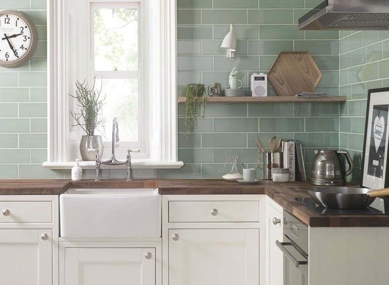
So, taking this into account, lets dissect a feature image to help explain the interior design rule! This kitchen space featuring our Aquarelle tiles in Pistachio is a great example of the 60/30/10 rule.

Table of Contents
The Fundamentals of the Rule
The rule considers the dynamics of colour in creating an aesthetically pleasing space, with the break down of the percentages and their correlating objects as the following:
60% – Your dominant colour, pattern, or texture, can be:
• wall colour
• rugs
• sofa
• ‘foundation’ pieces of furniture
30% – Your secondary colour, pattern, or texture, can be:
• side chairs/tables
• smaller ‘foundation’ pieces
• curtains
• a feature wall
10% – Your accent colour, pattern, or texture, can be:
• throws
• cushions/pillows
• decorative accessories
• artwork
So What About This Kitchen?
The white/neutral colour stands as the 60%, being the bulk of the ‘foundation’ pieces of the kitchen – the units and the window trims. The 30% is where this gorgeous pistachio colour comes in to play, brightening and reviving the kitchen with the tiles being a smaller foundation piece to adorn the walls. The wooden tones tie in as the 10%, as the worktop and other decorative accessories such as shelving and the hexagonal tray. Here, the dynamic of the colour and texture balance really gives this kitchen life, and you can see how effortless yet affective the rule is!
We’ve pieced together a few different variations of the 60/30/10 rule so you can explore it in a way that suits your tastes!
A Bold Accent Colour

Inject a pop of colour as your 10%!
This gorgeous bathroom design features bold lime accents among a Scandi-neutral colour scheme. Our Coast tiles in White Sands are featured here as their soft colour being the 60%, with wooden furniture being the secondary colour and texture.
The pop of green is enough to be striking, yet subtle enough as an introductory way to colour in your home decor.
Monochrome Blends

Choose pattern over colour to keep it monochrome!
These Kutlu Beige Mix tiles are the perfect feature to keep things fun, yet tonal. This living room set up has executed the the 60/30/10 rule by using pattern as a fundamental feature of the room.
We’re getting a colourway reminiscent of Dulux’s Colour of the Year 2021, which looks warm and inviting when paired with Moroccan inspired patterns.

Grey is timeless and elegant, and this cool dining room uses grey tones to its advantage.
Shades of grey defined by depth and texture really create a well thought of design here, as things don’t look too similar, despite the grey-on-grey theme.
A few natural textures and the feature of a plant really help to bring this room together as a simple yet stylish haven.
The Art of Creativity

Choose vivid colour as your 60% to really change up a room and go for creative design! We’re loving blues, in the footsteps of PANTONE’s Classic Blue, and paired with white the stark contrast of this kitchen, it really is eye catching.
This room blends modern cutting-edge aesthetic with rustic country features for the perfect 60/30/10 blend – vintage woods are far from flotsam and jetsum, as they add texture and depth to the design.
These Rustic Blue Reclaimed Wood Effect tiles feature a hint of blue in their grain effect for a cohesive and well-planned colourway.
Give 110%!

There’s no harm in giving anything 110% effort!
60/30/10 as we previously said is just creative guidance, so why not curate your own ratios to really take hold of your own interior design and create a more unique look?
Experiment with themes too – these tiles are art-deco inspired whereas the kitchen units are modern country. Combining interior design trends is a great way to be original!
In this gorgeous kitchen roomset, the ratio is divided something a bit more like this:
• 50% neutral white walls and accents
• 40% khaki green units
• 10% wooden effect
• 10% grey accessories
Experiment with colour and textures for a design that suits you and your interior design! The important thing to remember is this is just a general, and customisable, guide. Creativity has no set rules or order – it is all subjective and down to personal preference and imagination.
