
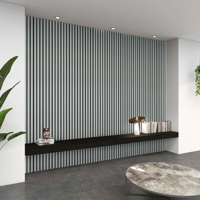
If you’ve scrolled through interior design accounts recently, you’ve probably seen rooms where the walls, ceiling, doors, and trim are all painted the exact same bold colour, top to bottom. That’s colour drenching, and it’s one of the biggest interior trends of 2026. Zillow reported mentions of colour drenching in property listings rose 149% over the past year, and it’s easy to see why: done well, it turns an ordinary room into something that feels considered, calm, and unmistakably on trend.
This guide covers what colour drenching actually is, why designers say it works even with the boldest colours, how to get the look room by room, and how to achieve it with a lower-maintenance option than paint: coloured wall panels. Many UK homes, especially Victorian and Edwardian terraces, already have picture rails, dado rails, or coving that give a natural stopping point for a colour change, which makes colour drenching easier to plan for than it might first appear.
Table of Contents
What is colour drenching?
Colour drenching means picking one colour and carrying it right through a room, across the walls, ceiling, skirting boards, door frames, and often the doors themselves, rather than contrasting the walls against white trim. The best colour-drenched rooms don’t actually use one single flat tone everywhere. They use several shades and finishes within the same colour family: a mid-tone on the main walls, perhaps a slightly lighter version on the ceiling, and the same colour picked up again in cushions, curtains, or a rug, so the whole room feels pulled together rather than just painted.
Because there’s no hard edge where the wall meets the ceiling or the skirting board, the eye has nowhere to stop and measure the room, which is what gives colour drenching its immersive, cocooning feel.
Why colour drenching works, even in bold colours
It sounds like it should make a small room feel smaller, or a bold colour feel overwhelming, but designers report the opposite. Interior designer Alicia Savin has described the effect as calming: “the lack of contrast keeps it in check,” even when the colour itself is intense. Without a defined edge between wall and ceiling, or wall and woodwork, your eye doesn’t stop and register the boundaries of the room the way it does when surfaces are broken up by contrasting colours, so the space can feel larger and more cohesive rather than boxed in.
There’s also a reason this trend has taken off now. As one paint brand’s colour strategist put it, homes are being asked to do more emotional work as the outside world gets noisier, and a colour-drenched room, with its lack of visual clutter, has a way of feeling like a retreat rather than just a place to store furniture. That’s worth bearing in mind in the UK in particular, where a lot of the year is spent indoors under grey skies, and a room’s colour scheme carries more weight simply because you spend more time looking at it.
How to colour drench a room with paint
Test large swatches before you commit
Paint at least an 8-by-8-inch patch on every wall and on the ceiling, not just one. Colour reads differently on different surfaces and at different times of day, and a shade that looks subtle on a small tester pot can look considerably deeper once it’s covering four walls and a ceiling. This matters more under British daylight than it might elsewhere: UK light levels change noticeably between a bright morning and an overcast afternoon, so check your swatches at a few different times of day before committing.
Use more than one shade of your chosen colour
A single flat tone across every surface can feel one-dimensional. Most successful colour-drenched rooms use a mid-tone on the walls, a lighter or darker variation on the ceiling and woodwork, and the same colour family picked up in fabrics and accessories, so there’s depth without breaking the overall effect.
Think about sheen as well as colour
An eggshell finish is popular for colour drenching because it has enough sheen to catch the light and add depth without looking as glossy or high-maintenance as full gloss.
Choose your colour family deliberately
Soft, muted pastels tend to give a relaxed, restful feel, which suits bedrooms well. Jewel tones such as deep emerald, sapphire, or aubergine bring drama and work well in dining rooms or studies. Dark, enveloping hues like charcoal or espresso brown are having a particular moment, and contrary to the old rule that dark colours shrink a room, in a fully drenched space they often make it feel cosier rather than smaller, which suits the kind of long, dim winters most of the UK is familiar with.
Getting the look without repainting: colour drenching with wall panels

Painting an entire room in one shade, ceiling and woodwork included, is a serious job, and it’s one you’ll need to repeat every few years as paint marks, scuffs, and fades, especially in a damp UK climate where condensation and central heating both take their toll on painted walls. Coloured wall panels are worth considering as a lower-maintenance way to get a very similar effect, particularly on the walls themselves, which is where most of the visual impact of colour drenching comes from.
Trepanel’s acoustic slat panels come in solid, consistent colourways such as denim blue, juniper green, and forest pine green, alongside a full run of wood tones from natural oak through to walnut brown and smoked oak, so you get the same uniform block of colour as a painted wall, with texture and shadow lines from the slats built in, and no drying time or brush marks. For a bathroom or shower room, waterproof panel ranges let you carry a single bold colour across the whole wet area in a way that would be far more high-maintenance with paint alone.
One technique borrowed directly from professional colour-drenched interiors: panel only the lower half of the wall, up to roughly dado height, and paint the upper wall and ceiling in a lighter shade from the same colour family. This draws the eye upward, adds a sense of height to the room, and gives you the durability of panelling exactly where walls take the most knocks, without panelling floor to ceiling. It’s also a natural fit for the many UK period properties that already have a picture rail or dado rail in roughly the right place to mark the changeover.
Colour drenching room by room
Living room
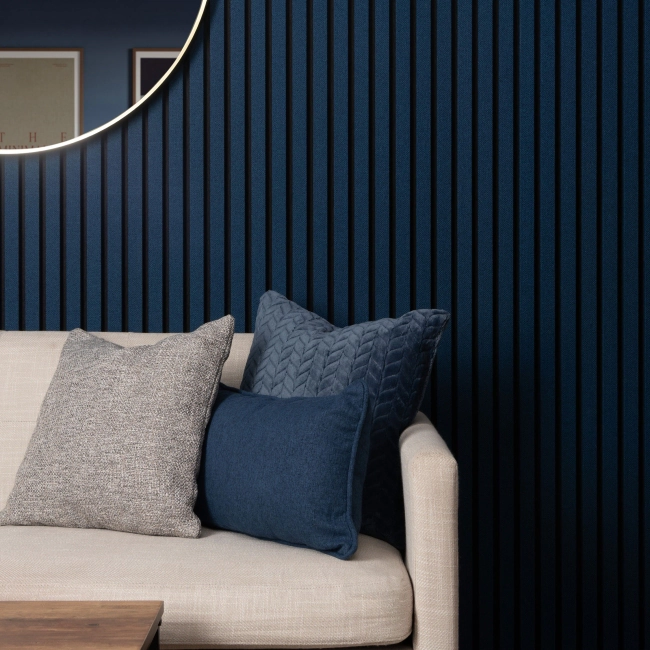
The living room is one of the best rooms in the house for colour drenching, since it can take a richer, bolder tone than a bedroom or hallway without feeling overwhelming. Panel the lower half of the wall in a rich, bold shade using a vertical slat finish, then layer a lighter, brighter version of the same colour above. Pull the same colour family through a sofa, curtains, or a large rug so the room feels styled rather than simply painted, which adds sophistication while still feeling calm and lived-in.
Bedroom
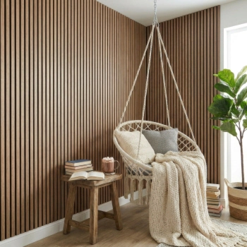
Bedrooms suit a softer approach than living rooms. Neutral shades such as cream, off-white, or soft grey complement most existing colour schemes and won’t fight with bedding or artwork. Lighting matters more here than in most rooms: a bedroom that relies mostly on artificial light in the evenings, which in the UK means most of the autumn and winter, will read colours as slightly heavier, so it’s worth leaning toward a lighter, more refreshing tone than you might first think. Panels behind the bed or as a headboard wall are an easy way to introduce colour drenching without committing the whole room.
Bathroom

Bathrooms have fewer soft furnishings to pull colour through, so the wall treatment has to do more of the work on its own. Soft, comforting hues tend to work best here, supporting a sense of calm rather than making a loud style statement. A waterproof panel range in your chosen colour, run across the whole wet area rather than just a splashback, gives the same drenched effect as paint with far less concern about condensation and upkeep, which matters in most UK bathrooms given how few have strong extractor ventilation. As with any panel purchase, it’s worth ordering a sample first, since bathroom lighting (often a mix of natural daylight and downlights) can shift how a colour reads compared with a showroom or a screen.
Hallway
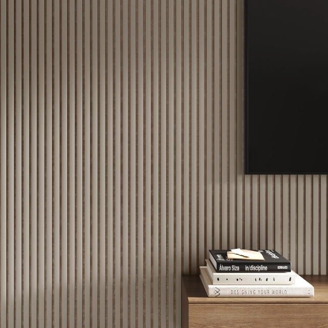
Hallways are often overlooked, but they’re a natural fit for colour drenching precisely because they’re transitional spaces rather than rooms you sit in for hours. Light, pale colours tend to work well in small or awkward-shaped hallways, since a dark drench can feel oppressive in a narrow space with limited natural light, which describes a lot of terraced and semi-detached hallways across the UK. For more visual interest, panel to dado height in a mid-tone and paint above in a paler version of the same colour, echoing traditional wainscotting: it adds a neat, considered detail and protects the lower wall from scuffs and bags in a high-traffic area.
Small rooms and box rooms
Small rooms are where colour drenching earns its reputation for making spaces feel larger rather than smaller, which is useful news for the smaller box rooms and box-bedrooms common in a lot of UK housing stock. A single shade carried across the walls, trim, and ceiling removes the visual break that normally makes a small room feel cut up into separate parts. Panels with a vertical slat or reeded profile add a further trick: the vertical lines draw the eye upward, adding a sense of height even in a boxy or low-ceilinged room, while still reading as one continuous colour from a distance.
Kitchen
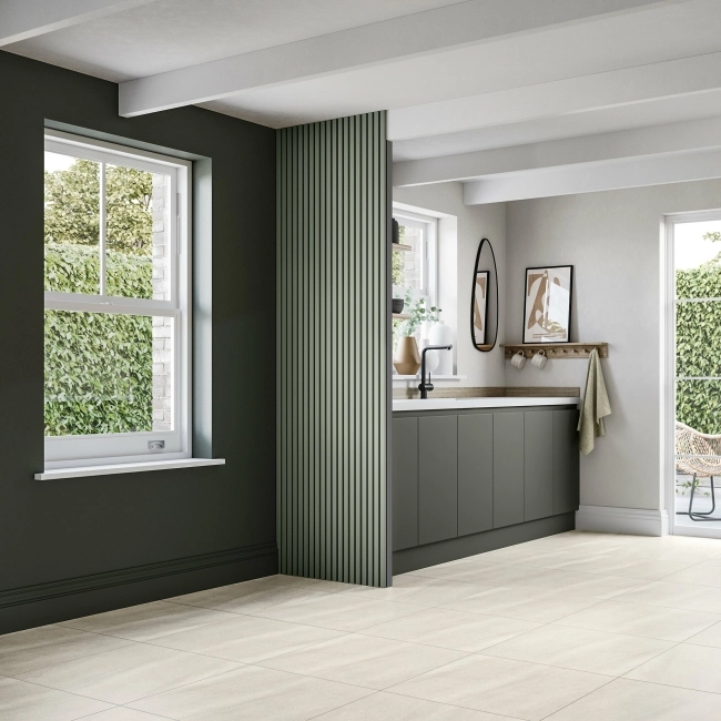
Kitchens are trickier to colour drench than most rooms, since a hob and sink rule out panelling in a couple of key spots, but the effect still works well if you split the job sensibly. Paint the walls, ceiling, and cabinetry in one colour family for the drenched effect, then use a tiled splashback behind the hob and sink for the heat and water resistance that a painted or panelled wall can’t match. If you have a dry run of wall, such as a breakfast bar, dining nook, or the end wall of a galley kitchen, that’s the spot to bring in a coloured wall panel in the same tone as the rest of the room, so the panelled area and the painted cabinetry read as one continuous colour scheme rather than two different projects.
Colour-specific drenching ideas
Green drenching
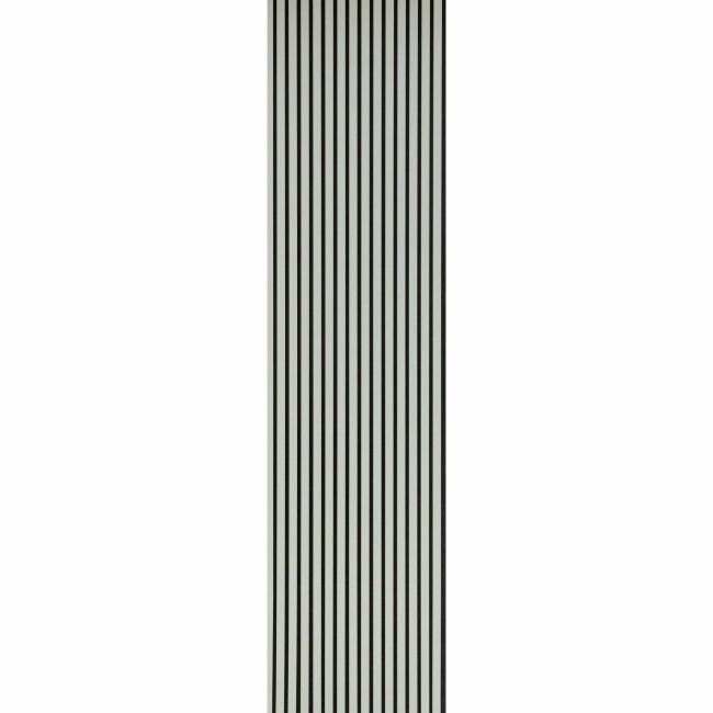
Green is one of the most forgiving colours to drench a room in, since different shades of green tend to harmonise with each other naturally in a way that’s harder to pull off with, say, reds or yellows. Trepanel’s Forest Pine and Juniper Green panels work well as a lower-half treatment, with a softer sage green or eucalyptus-leaning shade above in paint. Sage green in particular has become one of the most searched-for colour drenching shades, since it’s muted enough to feel calm rather than bold while still reading as a clear colour choice rather than a neutral. Pull the same green family through soft furnishings: a bottle green sofa, leafy-patterned curtains, and a handful of cream or oatmeal cushions to stop the scheme feeling too saturated.
Beige and neutral drenching
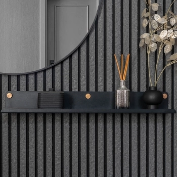
Beige has become a serious contender for colour drenching precisely because it’s warm without being dominant, making it a safer starting point if you’re new to the trend. Felt-backed acoustic panels in a warm greige or light oak tone add tonal depth and texture that a flat painted beige wall doesn’t have on its own, and they pair naturally with linen curtains, jute rugs, and warm wood furniture for a scheme that feels cosy rather than flat, which suits British homes for much of the year.
Denim blue drenching
Blue is a classic choice for colour drenching because it reads as calm rather than loud, even in a fairly saturated shade. Denim blue slat panels on the lower wall, with a paler sky blue or off-white above, give a coastal, relaxed feel that works particularly well in a cloakroom, home office, or bedroom. It’s a good option if you want the drenched look to make a statement without tipping into the drama of a jewel tone.
Getting it right: a few practical tips
Order a sample before you commit to a full room
Panel colours, like paint colours, can shift noticeably depending on the room’s lighting, and a small sample under your own lightbulbs is far more reliable than a photo on a screen.
Don’t rely on a single flat tone to do all the work
Mixing two or three shades of the same colour family, through panels, paint, and soft furnishings, gives a colour-drenched room the depth that makes the difference between looking styled and looking like a single can of paint was used on everything.
Match the intensity of the colour to how the room is used
Rooms you pass through or use for short periods, such as hallways, cloakrooms, and powder rooms, can take a bolder, more saturated colour than rooms you spend hours in, like a living room or home office.
FAQs
What is colour drenching?
Colour drenching is an interior design technique where a single colour, and often a few tonal variations of it, is carried across all the surfaces in a room, including the walls, ceiling, skirting boards, and door frames, rather than contrasting the walls against white woodwork. The aim is a seamless, immersive look with no hard edges where one colour meets another.
Do you paint the ceiling when colour drenching?
Yes, the ceiling is one of the key surfaces in colour drenching. Leaving it white while drenching the walls breaks the effect, since the contrast between ceiling and walls recreates the boxed-in look colour drenching is designed to avoid. Most colour-drenched rooms use the same colour, or a close lighter shade of it, on the ceiling as on the walls.
Does colour drenching make a room look smaller or bigger?
Bigger, in most cases. It’s a common worry that a bold, dark, or saturated colour will close a room in, but removing the contrast between walls, ceiling, and woodwork is what actually makes the space feel larger, since your eye no longer has a hard edge to stop at and measure the room by. This is especially true in small rooms and box rooms, where breaking the walls up into different colours tends to make the space feel more cramped, not less.
Is colour drenching a fad, or will it last?
Colour drenching draws on a design principle, removing contrast to make a room feel cohesive, that designers have used for decades, even if the term itself is new. The specific colours in fashion will likely move on over time, but the underlying technique of unifying a room’s surfaces is likely to stay in use well beyond this particular trend cycle.
Can you colour drench with wall panels instead of paint?
Yes. Coloured wall panels in a consistent shade achieve much the same seamless effect as painting a room in one colour, with the advantage of being more durable and easier to keep looking sharp, particularly in bathrooms and other high-moisture rooms where painted surfaces need more upkeep.
Should I order a sample before buying wall panels for colour drenching?
It’s worth it. Colour reads differently under different lighting, and a panel that looks right in a showroom photo or on screen can look noticeably different once it’s on your own wall under your own lighting. A sample lets you check the colour and texture in the room before committing to enough panels for a full wall.
In summary
Colour drenching works because it removes the contrast that normally breaks a room up into separate walls, a ceiling, and woodwork, replacing it with one connected colour story that reads as calm rather than overwhelming, even at its boldest. The best results mix a few tonal shades within one colour family and carry them through fabrics and accessories rather than relying on a single flat tone, and the right intensity depends on the room: bolder in a cloakroom or hallway you pass through, softer in a bedroom or living room you spend hours in.
If you like the look but want something more durable than paint, especially in a bathroom, hallway, or busy family space, browse Walls & Floors’ wall panel range and order a sample or two before you commit to a colour.
